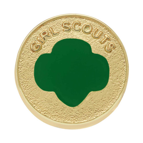
Trefoil Membership Pin
Star Rating
OVERALL STAR RATING
RATING BREAKDOWN
333199
by Tanya -
333199
by anonymous -
333199
by anonymous -
The new membership pin is as ugly as a mud fence.
by "Doc"
The new membership pin is as ugly as a mud fence. Whatever GSA paid the designer was way too much. C'mon, a naked, flat, green trefoil on a textured golden disc?!? To quote the Roman poet, Horace, "Parturient montes, nascetur ridiculus mus" ("The mountains will labor and will give birth to a ridiculous mouse.") At least they kept the 1920's design as an alternative.
333199
by anonymous -
333199
by anonymous -
333199
by anonymous -
333199
by anonymous -
333199
by anonymous -
333199
by anonymous -
333199
by anonymous -
333199
by anonymous -
Wonder how long before the background texture on t
by Mrs R
Wonder how long before the background texture on this pin goes away and it's just flat like the eagle pin, now the background on that one is just flat and cheap looking.
To my knowledge, the National Council did not vote
by True Girl Scout
To my knowledge, the National Council did not vote to approve this logo. When the Contemporary Pin (three faces) was made official, it was because the logo had been approved by the National Council to be an alternative to the Traditional Pin. This cannot be a marketing or shop decision. This is the logo of our organization worn everywhere we go. The National Council will meet again in three years if you want to try to get it approved.
Not only does this version of the trefoil pin look
by Ash.
Not only does this version of the trefoil pin look ugly, cheap and boring the functionality of the backing is bad as well. Instead of a typical pinch pin back it's now similar to how the insignia tab's pinning mechanism. Trying to pin it to the tab is a major pain in the butt due to the material thickness and type of the insignia tab. I really hope these get changed back to how they used to be.
333199
by anonymous -
Our troop does not care for this design and does n
by jhauenst
Our troop does not care for this design and does not want to change to the new pin. The consensus was it is "ugly" and "boring"
I’m not a fan of this style at all. Please bring b
by GS1912
I’m not a fan of this style at all. Please bring back the profiles membership pin!!
I really dislike this new pin. It’s boring and pla
by AutumnJenn
I really dislike this new pin. It’s boring and plain and uninspired. Bring back the pin with the faces.
333199
by anonymous -
333199
by anonymous -
Out of nine 6th graders, none wanted this pin. Th
by GSWWleader
Out of nine 6th graders, none wanted this pin. They all wanted the old green/gold faces one, but opted for the traditional gold one since that was unavailable. I don't care for this design either, and viewing the pin in person, it looks and feels cheap.
333199
by bill -
3.50 pin x 5,000,000+ girls = CEO bonus. ripping o
by Meeee
3.50 pin x 5,000,000+ girls = CEO bonus. ripping off girls and their families
333199
by Maye -